After more than 40 years of operation, DTVE is closing its doors and our website will no longer be updated daily. Thank you for all of your support.
Netflix unveils major site upgrade
 Netflix has unveiled what it says is the first major update to its site in four years, designed to make it “faster and easier” for viewers to find content.
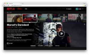
The revamp, which Netflix will roll out globally over the next two weeks, is designed to make the website work “more like an app and less like a series of linked web pages.”
Netflix said that the new site offers a “more visual experience” and responds to changing viewing habits, with viewers now used to spending more time using mobile and tablet apps.
“Information appears in-line and in context rather than on a separate page, which makes exploring the catalogue faster than ever before. When you hover your mouse over a title, you will now see a slideshow of images from that movie or show. We hope this slideshow will give you a better feel for what the show is about than reading the description alone,” said Netflix’s director of product innovation, Cameron Johnson, in a blog post.
Other features of the new site include an ‘inline details pane’ so users can browse episodes and read details when they click on a title. Viewers can also find similar titles by clicking ‘More Like This’, or jump to titles with the same cast, genre or mood.
Netflix also said that scrolling through rows of titles is now “much faster” and that the new website is designed to work regardless of whether a viewer is using a mouse, trackpad, or a touch screen to access it.


